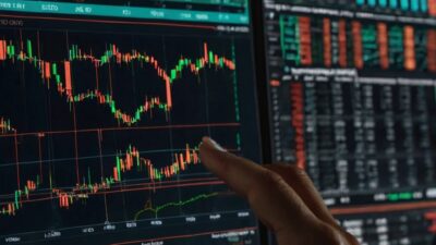


If price action had a voice, it would speak through candlestick charts. These elegant visual tools don’t just show where the market’s been, but they also reveal the emotional tug-of-war between buyers and sellers. Whether you are trading crypto, stocks, or forex, candlestick charts are one of the most powerful ways to decode market sentiment, spot trend reversals, and time your entries with precision.
In this post, you will learn how to read candlesticks like a pro, from understanding their core components to recognizing high-impact patterns. We will also explore the different types of candlestick formations, how to use them across timeframes, and the limitations every trader should watch out for. Are you ready to turn the price data into insight? Let’s dive in.
What Is a Candlestick Chart?
A candlestick chart is a type of financial chart used to show price movements of an asset, like stocks, cryptocurrencies, or currencies, over time. It is popular among traders because it packs a lot of information into a simple visual format.
Candlestick charts were developed in 18th-century Japan by a rice trader named Munehisa Homma. He used them to track rice prices and market psychology, essentially the emotions of buyers and sellers. His methods laid the foundation for modern technical analysis.
Each “candlestick” in the chart represents a specific time period, such as 1 minute, 1 hour, or 1 day, and shows four key prices: opening, closing, high, and low. The body of the candle shows the range between opening and closing prices.
If the close is higher than the open, the candle is usually green or white, indicating an upward price movement. If the close is lower than the open, it is marked as red or black, indicating the price went down. The wicks (or shadows) show the highest and lowest prices during that time.
Crypto, forex, and stock traders love candlestick charts because they show price direction and volatility at a glance, help identify patterns like reversals or trends, and work well with technical indicators and strategies.
Below is a detailed breakdown of how candlestick charts differ from line charts and bar charts.
| Chart Type | What It Shows | Pros | Cons |
| Line Chart | Only closing prices over time | Simple and clean view of trends | Lacks detail |
| Bar Chart | Open, high, low, close (OHLC) | More info than line charts | Less visual than candlesticks |
| Candlestick | OHLC + visual direction | Intuitive and pattern-friendly | Slightly more complex |
Candlestick charts are like the Swiss Army knife of trading visuals, compact, versatile, and powerful.
Components of a Candlestick
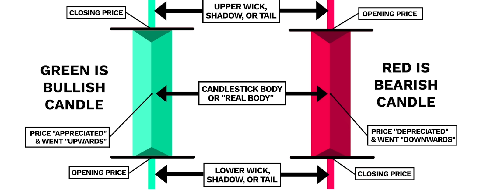
Here is a clear breakdown of the components of a candlestick chart to help you understand how each part works.
- Body – Open vs Close Price: The body is the thick part of the candlestick. It shows the difference between the opening and closing prices during a specific time period. If the close is higher than the open, the body is typically green or white and represents a bullish momentum (price went up). If the close is lower than the open, the body is usually red or black, representing a bearish trend (indicating a price decrease).
- Wicks/Shadows – High and Low: The thin lines above and below the body are called wicks or shadows. They show the highest and lowest prices reached during that time. The upper wick stretches from the top of the body to the highest price, while the lower wick goes from the bottom of the body to the lowest price.
- Color/Fill – Bullish vs Bearish: Green or white candlesticks represent a bullish run (price increased) while red or black candlesticks show a bearish trend (price decreased). The color helps traders quickly spot market sentiment and momentum.
How to Read a Candlestick Chart
Reading a candlestick chart is like learning the language of price action, as it tells you who is in control: buyers or sellers. Let’s break it down.
1. Each Candle Tells a Story
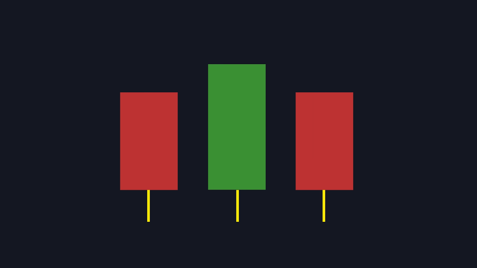
A single candlestick shows what happened to the price during a specific time period:
- Open: Where the price started.
- Close: Where it ended.
- High: The highest price reached.
- Low: The lowest price reached.
The shape and color of the candle reveal market sentiment:
- Bullish candle (green/white): Buyers were stronger and the price closed higher than it opened.
- Bearish candle (red/black): Sellers were stronger and the price closed lower than it opened.
2. Timeframes: 1m, 1h, 1d. What Do They Mean?

Each candle represents a different time period depending on the chart setting:
- 1-minute (1m): Each candle = 1 minute of trading. Great for scalping or fast-paced trading.
- 1-hour (1h): Each candle = 1 hour. Useful for intraday trends.
- 1-day (1d): Each candle = 1 full trading day. Ideal for swing or long-term analysis.
The same pattern can mean different things depending on the timeframe. A bullish candle on a 1-minute chart might be noise, but on a daily chart, it could signal a trend reversal.
3. Reading Sentiment: Who is Winning?
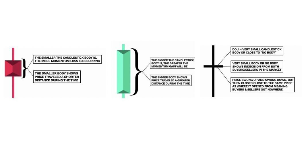
Traders use candlesticks to gauge buying and selling pressure:
- Long green candle: Strong buying momentum.
- Long red candle: Strong selling pressure.
- Small body, long wicks: Indecision or a potential reversal, such as, doji or spinning top.
- No upper wick: Buyers pushed the price to the top and held it.
- No lower wick: Sellers dominated.
Patterns like engulfing candles, hammers, or shooting stars give clues about potential reversals or continuations.
Types of Candlestick Chart Patterns
Candlestick chart patterns are powerful tools that traders use to predict market direction. These patterns reflect the psychology of buyers and sellers and are grouped into three main categories: single, double, and triple candlestick patterns. While they offer valuable insights, they work best when combined with confirmation tools like volume, trendlines, or indicators.
Single Candlestick Patterns
These patterns consist of one candle and often signal potential reversals or indecision.
| Pattern | Signal Type | Description |
| Doji | Indecision | Open and close are nearly equal. It signals market uncertainty or a potential reversal. |
| Hammer | Bullish | Small body with long lower wick. Appears after a downtrend, suggesting a reversal. |
| Shooting Star | Bearish | Small body with long upper wick. Appears after an uptrend, signaling a potential drop. |
| Inverted Hammer | Bullish | Similar to a shooting star, but appears after a downtrend. Suggests reversal. |
| Spinning Top | Neutral | Small body with long wicks. Indicates indecision and possible trend pause. |
Double Candlestick Patterns
These involve two candles and often indicate stronger reversal signals.
| Pattern | Signal Type | Description |
| Bullish Engulfing | Bullish | A small red candle followed by a large green candle that engulfs it. Appears after a downtrend. |
| Bearish Engulfing | Bearish | A small green candle followed by a large red candle. Appears after an uptrend. |
| Piercing Line | Bullish | A red candle followed by a green candle that closes above the midpoint of the red. |
| Dark Cloud Cover | Bearish | A green candle followed by a red candle that closes below the midpoint of the green. |
| Tweezer Tops/Bottoms | Reversal | Two candles with similar highs (tops) or lows (bottoms). Suggests a reversal. |
Triple Candlestick Patterns
These consist of three candles and offer strong signals for trend reversals or continuations.
| Pattern | Signal Type | Description |
| Morning Star | Bullish | Red candle → small-bodied candle → green candle. Appears after a downtrend. |
| Evening Star | Bearish | Green candle → small-bodied candle → red candle. Appears after an uptrend. |
| Three White Soldiers | Bullish | Three consecutive green candles with higher closes. Strong uptrend signal. |
| Three Black Crows | Bearish | Three consecutive red candles with lower closes. Strong downtrend signal. |
| Abandoned Baby | Reversal | A doji candle is isolated between a red and green candle. It is a rare but powerful reversal signal. |
Advantages of Using Candlestick Charts
Candlestick charts are a favorite among traders for good reason. Here is a breakdown of their key advantages.
- Easy to Read: Candlestick charts present price data in a compact, visual format. Each candle shows the open, high, low, and close prices, making it easier to grasp market movement at a glance.
- Visually Intuitive: The color and shape of candles instantly convey whether buyers or sellers are in control. Green/white candles = bullish; red/black candles = bearish. Long wicks or small bodies hint at indecision or volatility.
- Reveals Market Psychology: Candlestick patterns reflect trader sentiment, including fear, greed, and uncertainty. Patterns like doji, hammer, and engulfing candles help traders interpret emotional shifts in the market.
- Works Across Timeframes: Candlestick charts are flexible as they work for 1-minute scalping, hourly intraday trading, or daily swing analysis. This makes them useful for all types of traders, from beginners to pros.
- Early Reversal Signals: Candlestick patterns often signal reversals before they appear on line charts. For example, a hammer or morning star can hint at a trend change even when the overall price trend still looks bearish on a line chart.
Candlestick charts don’t just show price; they tell a story. And when combined with volume, indicators, or support/resistance levels, they become even more powerful.
What are the Limitations of Candlestick Charts?
Candlestick charts are powerful tools, but they are not perfect. Here are the key limitations every trader should be aware of.
- False Signals: Candlestick patterns can look promising but fail to deliver. A bullish engulfing pattern might appear, but the price could still drop if broader market conditions don’t support it. Without confirmation, traders risk acting on misleading signals.
- Subjective Interpretation: Reading candlestick patterns involves judgment and experience. Two traders might interpret the same pattern differently; one sees a reversal, the other sees continuation. This subjectivity can lead to inconsistent decisions.
- Less Effective in Sideways or Low-Volume Markets: Candlestick patterns work best in trending markets. In choppy or low-volume conditions, patterns lose reliability and often result in whipsaws or noise. Indecisive candles like dojis or spinning tops are common, but not always meaningful.
- Need for Confirmation Tools: Candlesticks alone aren’t enough, as they should be paired with volume indicators (OBV, volume spikes), momentum indicators (RSI, MACD), and support/resistance levels. Confirmation helps validate the pattern and reduce false entries.
Candlestick Charts vs Other Chart Types
Candlestick charts, line charts, and bar charts are the three most common ways to visualize price movements in trading. Each has its strengths depending on what you are trying to analyze, whether it is a quick overview or a deep dive into market behavior.
| Chart Type | What It Shows | Best For | Pros | Cons |
| Line Chart | Only closing prices over time | Quick trend overview | Simple, clean, and easy to read | No details on intraday movement |
| Bar Chart | Open, high, low, close (OHLC) | Technical analysis | Shows full price range | Less visual than candlesticks |
| Canlestick | Open, high, low, close + sentiment | Pattern recognition and trading setups | Visually intuitive and shows psychology | It can be overwhelming for beginners |
Use line charts when you want a clean overview of price trends, analyzing long-term movement without needing intraday details, and comparing multiple assets on one chart.
Use bar charts when you need precise price data (OHLC) but prefer a more compact view than candlesticks. This is ideal for technical analysis and viewing price ranges.
Stick with candlestick charts when you want to understand market sentiment (buying vs selling pressure), look for reversal or continuation patterns, and make short-term or intraday trading decisions.
Candlestick charts are the most popular among active traders because they combine price data with visual cues that reflect market psychology. But for quick snapshots or comparisons, line charts still shine.
Candlestick Chart Strategies for Traders
Candlestick chart strategies are essential tools for traders who want to decode market psychology and make smarter decisions. While candlestick patterns offer powerful insights, they become far more effective when combined with other technical tools. Here is how to elevate your trading game using candlestick charts.
Combining Patterns with Support & Resistance
Support is a price level where buying interest is strong enough to prevent the price from falling further, while resistance is where selling pressure tends to halt upward movement. Candlestick patterns like hammers, engulfing candles, or dojis are more reliable when they appear near these key levels. A bullish engulfing pattern at a support zone often signals a strong reversal. Traders use these zones to time entries and exits more precisely.
Using Candlestick Patterns with Volume Confirmation
Volume shows the strength behind a price move. A candlestick pattern backed by high volume is more trustworthy than one formed on low volume. A morning star with rising volume on the third candle suggests strong buying interest. Volume helps filter out false signals and confirms whether a breakout or reversal is genuine.
Pairing Candlesticks with Moving Averages
Moving Averages (MAs) smooth out price data and reveal trends. Candlestick patterns near MAs can signal trend continuation or reversal. For example, a hammer forming just above the 50-day MA may indicate a bounce. Similarly, a bearish engulfing below the 200-day MA could signal a deeper downtrend. MAs also act as dynamic support/resistance, adding context to candlestick signals.
Risk Management When Trading Patterns
Always use stop-loss orders to protect against unexpected moves and avoid overtrading, as not every pattern is worth acting on. Wait for confirmation before entering a trade and use indicators like RSI or MACD. Look for follow-through candles or volume spikes. Risk management ensures that even if a pattern fails, your losses are controlled.
Mistakes Traders Make With Candlestick Charts
Candlestick charts are powerful, but they are not foolproof. Many traders fall into common traps when using them. Here is a breakdown of typical mistakes and how to avoid them.
- Relying Only on Candlestick Patterns: This mistake involves acting on a pattern without considering other indicators or market context. Always combine candlestick analysis with tools like volume, moving averages, RSI, or MACD for confirmation.
- Ignoring Timeframe Context: This mistake involves misinterpreting a pattern by failing to consider the timeframe in which it appears. A bullish pattern on a 1-minute chart may be noise, while the same pattern on a daily chart could signal a major reversal. Align your analysis with your trading style, such as scalping, swing, and long-term.
- Overtrading Based on Patterns: This mistake involves jumping into trades every time a pattern appears, even in unclear market conditions. Be selective. Only trade patterns that appear near key support/resistance levels or are backed by strong volume and trend context.
- Forgetting Risk Management: This mistake involves trading without stop-loss orders or risking too much on a single pattern. Use stop losses to protect your capital. Never risk more than a small percentage of your account on one trade. Wait for confirmation before entering.
Use candlestick patterns as part of a broader strategy, not in isolation. Always consider the timeframe and market context. Be disciplined and patient, as not every pattern is worth trading. Prioritize risk management to stay in the game long-term.
Tools & Platforms to Practice Candlestick Charting
Here is a curated list of popular platforms where traders, especially beginners, can practice candlestick charting to analyze patterns and build confidence. Each offers different features, pricing tiers, and market access.
- TradingView: It is a Web-based charting platform with access to stocks, crypto, forex, and indices. It offers interactive candlestick charts with multiple timeframes, pattern recognition tools, community scripts, and features like paper trading and strategy backtesting. TradingView offers a free basic plan and paid tiers starting at $14/month, which include more indicators and alerts.
- Binance: It is a cryptocurrency exchange that offers real-time candlestick charts for hundreds of crypto pairs, built-in TradingView integration, and educational guides for beginners. Binance is free to use, but trading fees apply.
- Coinbase Advanced: It is a Crypto trading platform that offers advanced charting with candlestick views, depth charts, order book overlays, and a simple interface for new traders. Coinbase Advanced offers free access, but trading fees vary.
- StockCharts: It is a technical analysis platform with access to stocks, ETFs, and mutual funds. It offers candlestick charting with overlays and indicators, pre-built chart styles, scanning tools, educational resources, and webinars. StockCharts offers both free limited access and paid plans from $14.95/month.
- TrendSpider: It is an AI-powered charting and analysis tool with access to Stocks, ETFs, and crypto. It offers automated candlestick pattern recognition, backtesting, multi-timeframe analysis, smart alerts, and strategy building. TrendSpider is paid only, and it starts at $54/month.
Learn Crypto Trading With Dypto Crypto in a Fun and Engaging Way
Ready to dive into crypto trading? Let Dypto-Crypto be your guide. If you are excited to put your candlestick chart knowledge into action, there is no better place to start than Dypto-Crypto. Whether you are a total beginner or brushing up your skills, we offer a treasure trove of easy-to-follow tutorials, interactive blogs, and real-world trading tips designed to make learning fun and stress-free.
Learn through visuals, quizzes, and real chart examples. Connect with other learners and get feedback from experienced traders in our community hub. Whether you are curious about crypto, want to master candlestick patterns, or build a full trading strategy, Dypto-Crypto makes the journey exciting and empowering. Start exploring today and turn your curiosity into confidence, one candle at a time.
Frequently Asked Questions (FAQs)
Q: What are the most common candlestick chart patterns?
A: The most common candlestick chart patterns that traders use to identify potential market reversals or continuations include single candlestick patterns, double candlestick patterns, and triple candlestick patterns.
Q: Which timeframe is best for reading candlestick charts?
A: The best timeframe for reading candlestick charts depends on your trading style and goals. For short-term traders, use 5–15 minute charts for fast entries and exits. For medium-term traders, use 1–4 hour charts for clearer setups with less noise. As a long-term trader, use daily or weekly charts for strong, reliable signals.
Q: Do candlestick patterns work better in crypto than stocks?
A: Candlestick patterns work in both crypto and stock markets, but their effectiveness can vary depending on market conditions and characteristics. Candlestick patterns are not inherently better in one market over the other; they are simply tools. Their success depends on market context, timeframe, volume, and confirmation indicators.
Q: Can beginners learn candlestick charts easily?
A: Absolutely. Beginners can easily learn candlestick charts, as they are among the most beginner-friendly methods for understanding price action in trading.
Disclaimer
This article is for educational and information purposes, and should not be considered financial advice. For more information visit our disclaimer page
About the Author