
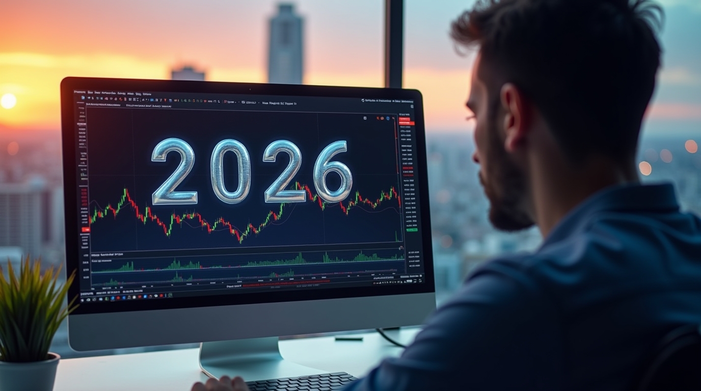
The crypto market in 2026 is certainly not what it used to be. We have got institutions that are throwing around billions, regulatory clarity finally happening and AI systems doing things that would have seemed impossible a few years ago. But here’s the thing that hasn’t changed: professional traders who consistently win aren’t using some secret magic indicator. They’re simply combining 2-3 solid tools from different categories and actually sticking to their plan.
The real game-changer for 2026? We’re finally seeing that on-chain data and traditional technical analysis work together. Sure, RSI and MACD are still your bread and butter, but now you can also track things like stablecoin supply and see exactly what whales are doing before the big moves happen. Recent research also shows that mixing on-chain metrics with classic indicators using machine learning can actually predict Bitcoin’s direction with 82% accuracy. That’s not magic, that’s just better tools.
But let’s be real, success isn’t about having fancy indicators. It’s about understanding crypto’s unique quirks. This market never sleeps, actually trades 24/7, swings way harder than stocks, and yeah, manipulation is still a thing. Right now, 72% of Bitcoin supply is locked up and illiquid, meaning it’s not even being sold. Moreover, big institutions control a huge part of the market now.
This guide breaks down the 12 indicators that actually matter in 2026. The guide explains how they work in real crypto markets, when to use them. And most importantly, how to combine them without overcomplicating things.
12 Best Indicators Every Crypto Trader Should Know in 2026
Here are all the main indications that you need to know when you’re doing crypto trading. Before we dive into each one, here’s a table outlining their main qualities.
| Indicator | Type | Primary Purpose | Best For | Timeframe |
| Moving Averages | Trend | Identify trend direction and strength | All traders | All timeframes |
| RSI | Momentum | Spot overbought/oversold conditions | Day/swing trading | 5min-daily |
| MACD | Momentum/Trend | Confirm trend changes and momentum | Swing/position trading | 1hr-weekly |
| Bollinger Bands | Volatility | Measure volatility and potential breakouts | Day/swing trading | 15min-daily |
| OBV/Volume | Volume | Validate price moves with volume | All traders | All timeframes |
| Stochastic | Momentum | Identify reversal points | Scalping/day trading | 1min-4hr |
| Fibonacci | Support/Resistance | Find potential reversal levels | Swing/position trading | 4hr-weekly |
| Parabolic SAR | Trend | Track trend and set trailing stops | Trending markets | 15min-daily |
| On-Chain Metrics | Sentiment | Analyze network activity and flows | Position trading | Daily-weekly |
| Support/Resistance | Price Action | Identify key price levels | All traders | All timeframes |
| Ichimoku Cloud | Comprehensive | All-in-one trend analysis | Swing/position trading | Daily-weekly |
| VWAP | Volume/Price | Determine intraday fair value | Day trading | 5min-1hr |
1. Moving Averages (SMA, EMA, 50/200 MA)
Moving averages smooth out price noise, allowing you to see the underlying trend. Simple Moving Averages (SMA) just average prices over a period. Exponential Moving Averages (EMAs) give recent prices more weight, making them respond faster to current price movements.
How it works in crypto: Here’s something that new traders often ignore: traditional stock markets use 20-day SMAs for monthly averages because they trade 5 days a week. But crypto? It never sleeps, it’s literally trading 24/7! That means that your monthly average should actually use 28-30 periods, not 20. The legendary Golden Cross (50-day SMA crossing above 200-day SMA) still works beautifully in crypto. Bitcoin’s May 2020 Golden Cross kicked off an absolute monster run from $9,500 to over $60,000. On the flip side, the Death Cross (when it goes the opposite way) called March 2018’s bear market, and Bitcoin dropped 56%. It was painful for those who ignored it.
Ideal conditions: Moving averages truly shine when an actual trend is in place. But they will mess you up during sideways action with false signals all day long. Professional traders layer them like this: fast EMAs (9, 21) for scalping when you’re glued to the screen, medium (20, 50) for swing trading, and long (50, 200) for the big-picture view. The strongest setup is when everything has lined up perfectly! It’s when the price is above 20 EMA, 20 above, and of course, 50 above 200. That’s maximum bullish momentum, and it’s beautiful when it happens.
Practical example: Let’s imagine you are swing trading Bitcoin during an uptrend. The price is staying nicely above the 50-day moving average. Then Bitcoin suddenly dips and touches that 50-day line at $95,000! This is your chance to enter. You put your stop-loss slightly below this, around $94,000, and aim for the next resistance at $102,000. That gives you a clean 7:1 risk-to-reward, and it happened by paying attention to one important moving average.
2. Relative Strength Index (RSI)
RSI measures momentum by capturing recent gains and losses on a 0-100 scale. The standard overbought (70) and oversold (30) levels still matter, but, crypto being crypto, things can stay extreme for a long time longer than you’d expect in traditional markets.
How it works in crypto: During Bitcoin’s 2021 bull run, RSI stayed above 70 for weeks. All those traders who sold just because “RSI was overbought”? They missed absolutely massive gains. Professional crypto traders adjust their RSI periods based on what they’re doing: 7-period for day trading (faster response), 14 for most situations, and 21 for longer-term plays (filters out noise). Recent backtesting shows that RSI plus MACD together achieves 52-80% win rates, versus 50-55% for RSI alone. That might not sound huge, but in trading, even a small edge like that compounds over time.
Ideal conditions: RSI absolutely crushes it at catching divergences. When price makes lower lows but RSI makes higher lows, that’s often your bullish reversal signal flashing bright. It works best in range-bound markets where things actually bounce between overbought and oversold like a predictable tennis match. In strong trends, though, RSI can stay extreme forever, making it way less reliable as a standalone signal.
Practical example: You’re day trading Ethereum, and RSI drops to 28 (oversold territory). Price bounces off support at $2,800. When RSI crosses back above 30, you enter long at $2,850. You keep an eye on it and wait for RSI hitting 70 (overbought) to take profits, catching a nice 6% move to $3,020. Simple stuff, but super effective when combined with actual price action.
3. MACD (Moving Average Convergence Divergence)
The MACD displays both momentum and trend direction through three parts. First, there’s the MACD line (12-period EMA minus 26-period EMA), then the signal line (9-period EMA of MACD), and lastly the histogram showing the difference between them. Crossovers between these lines give you your buy and sell signals.
How it works in crypto: Standard settings work okay, but crypto’s fast price action often benefits from quicker configurations. Linda Raschke’s (3, 10, 16) settings catch trend changes 5-10 candles earlier than default, which is especially valuable for those wild altcoins that move like they’re caffeinated. The downside? MACD lags. During Ethereum’s May 2022 flash crash, it didn’t signal the drop in time. By the time MACD caught up, people were already getting liquidated.
Ideal conditions: MACD performs best during trending markets, giving you reliable crossovers to ride entire rallies without second-guessing yourself. Bitcoin’s 2020-2021 run from $7,000 to $64,000 saw the MACD remain consistently bullish, with reliable signals throughout. Life was good for MACD traders during that period. It works optimally on 4-hour to daily charts, where it filters noise better than those anxiety-inducing shorter timeframes.
Practical example: Let’s assume that you’re swing trading, and Bitcoin’s MACD line crosses above the signal line (bullish crossover). Meanwhile, the RSI reads 45 (neutral but turning bullish). You enter at $88,000. Then you hold patiently until MACD shows a bearish crossover at $96,000, capturing a clean 9% gain. The MACD crossover gave you clear entry and exit signals, no guessing involved.
4. Bollinger Bands
Bollinger Bands visualize the volatility through three lines. There’s a 20-period SMA middle band with upper and lower bands set at two standard deviations. The bands expand when volatility increases, and they contract during calm periods. These “squeezes” often come right before major breakouts that’ll wake you up at 3 AM.
How it works in crypto: Crypto’s extreme volatility means you often need wider bands, using 2.5 or 3 standard deviations instead of 2 to avoid getting faked out on illiquid altcoins. The big challenge here is that during strong trends, the price can “ride the bands” for weeks on end. Bitcoin’s 2021 bull run saw prices stay near the upper band for months, generating premature sell signals that cost traders significant gains. Frustrating to watch from the sidelines.
Ideal conditions: Bollinger Bands excel at identifying potential reversals and breakout setups. When bands squeeze really tight, volatility is compressed like a coiled spring, and something significant is about to pop off. Backtesting shows 4% monthly returns from mean-reversion strategies on daily timeframes, which compound nicely over time if you’re patient.
Practical example: Bitcoin is trading at $92,000, with Bollinger Bands contracting over the past two weeks. Everyone’s getting bored, the volume is drying up. Then, suddenly, four strong candles close above the upper band, with volume spiking 2.5x the average. That’s a valid breakout, not a fake. Enter at $92,000, stop-loss at $88,000, exit when price breaks below the 20 SMA at $106,000. That’s a solid 15% gain from correctly reading volatility.
5. On-Balance Volume (OBV) and Volume Flow Indicators
OBV keeps a running total of volume, adding on up days and subtracting on down days. The resulting line should generally follow the price like a shadow. When it doesn’t, that divergence is screaming a warning about potential reversals.
How it works in crypto: OBV excels at confirming trends and spotting those sneaky divergences. If the price climbs while OBV falls, that means that the buying pressure is weakening despite rising prices. That’s your bearish warning bell. On the other hand, if the price drops but OBV rises, the selling pressure is fading, and accumulation might be happening under the surface. This really matters in crypto, where wash trading and manipulation can make price signals completely misleading.
Ideal conditions: OBV works best on liquid cryptocurrencies like Bitcoin and Ethereum, where volume data is actually reliable and meaningful. On low-volume altcoins, it gives false signals everywhere due to irregular trading patterns. It combines powerfully with price action: when price breaks resistance with OBV making new highs simultaneously, that breakout has serious confirmation behind it.
Practical example: Solana climbs from $150 to $170 with OBV climbing right alongside it, confirming this is a healthy trend with real buying pressure. Then Solana pushes to $180, but OBV barely moves or actually dips. That divergence indicates that buying pressure is weakening. You tighten your stop-loss and prepare to exit, successfully avoiding the subsequent pullback to $165. That’s OBV saving your profits right there.
6. Stochastic Oscillator
The Stochastic Oscillator measures where price closed relative to its recent range, comparing the current closing price to the 14-period high-low range on a 0-100 scale. Above 80 means overbought, below 20 means oversold.
How it works in crypto: Signals come from crossovers when the fast %K line crosses above the slow %D line in oversold territory, which suggests bullish momentum is building. The crosses below are in overbought territory, suggesting bearish momentum is taking over. The crypto challenge here: markets can stay overbought or oversold way, way longer than traditional markets during strong trends, generating persistent false signals that’ll test your patience.
Ideal conditions: Stochastic works best on timeframes of 15 minutes to 4 hours for day trading. Below 5 minutes, it’s just too noisy to be useful. The oscillator excels in range-bound markets where overbought and oversold extremes give you clear reversal signals, but it underperforms badly when trends are strong and just keep going.
Practical example: On Ethereum’s 1-hour chart, Stochastic drops to 12 (deeply oversold) while price bounces off support at $3,200. When %K crosses above %D, you enter long at $3,220, targeting that overbought level around 80. The position captures a nice move to $3,400 (5.6% gain) before Stochastic reaches overbought and reverses. Classic momentum trading that actually works.
7. Fibonacci Retracement Levels
Fibonacci retracements identify potential support and resistance levels based on the mathematical sequence in which each number equals the sum of the two before it. Key ratios of 23.6%, 38.2%, 50%, 61.8%, and 78.6% are applied by connecting a swing high to a swing low, generating horizontal lines that the price seems to magically respect.
How it works in crypto: The 61.8% “Golden Ratio” level is often the most reliable, as it marks where peak greed in uptrends and peak fear in downtrends often find support or resistance. Studies analyzing Bitcoin and Ethereum show that all major Fibonacci levels acted as temporary support during uptrends, confirmed by multiple tests. It’s spooky how well these work sometimes.
Ideal conditions: Fibonacci works best on 4-hour and daily charts, where it filters out all that intraday volatility noise. Never, ever use it alone, though. The winning approach combines it with volume confirmation, candlestick patterns, and momentum indicators. When the price reaches a Fibonacci level, the RSI shows oversold conditions, and a bullish engulfing candle forms with a volume spike, that confluence creates the high-probability setups traders dream about.
Practical example: After Ethereum moves impulsively from $2,400 to $3,600, you apply Fibonacci from low to high. Price pulls back to the 61.8% level at $2,858 and starts consolidating there. Combined with RSI at 42 (neutral territory) and increasing volume, you enter long at $2,870. Trend resumes back to $3,400 for an 18% gain. Fibonacci gave you the precise entry zone, not just a vague area.
8. Parabolic SAR (Stop and Reverse)
Parabolic SAR provides both trend direction and trailing stop-loss levels through dots plotted above or below the price. Dots below price signal uptrend, dots above signal downtrend. The indicator automatically adjusts stop-loss levels as trends progress, which is pretty handy.
How it works in crypto: SAR excels in trending markets, helping you ride strong moves while automatically adjusting protective stops. The dots accelerate (move closer to price) as trends mature, tightening stops to lock in profits before things reverse on you. However, SAR generates frequent false signals in choppy, sideways markets, whipsawing you in and out of positions unnecessarily until you want to throw your laptop out the window.
Ideal conditions: Parabolic SAR works best on 15-minute to daily timeframes during clear, obvious trends. It’s particularly valuable for traders who struggle with emotional stop-loss placement (and let’s be honest, that’s most of us). SAR provides objective, rule-based stops that remove the emotional “should I move my stop?” question. Combine it with trend confirmation tools, such as moving averages, to filter out those frustrating sideways periods.
Practical example: Bitcoin enters a strong uptrend from $85,000 with SAR dots sitting comfortably below the price, acting as your trailing stops. As the price climbs to $95,000, SAR adjusts from $84,000 to $90,000, automatically protecting those juicy profits. When SAR flips above price at $94,000, you exit, capturing most of the trend before the reversal hits—emotion-free trading at its finest.
9. On-Chain & Sentiment Indicators (Crypto-Specific)
On-chain indicators analyze blockchain data such as network activity, wallet movements, and supply dynamics. This provides insights that are literally impossible in traditional markets. You can’t see inside stock exchanges like this, but blockchain transparency lets you peek behind the curtain. Key metrics include MVRV ratio, exchange flows, stablecoin supply, and whale activity.
How it works in crypto: MVRV (Market Value to Realized Value) compares market cap to aggregate cost basis. MVRV above 3.5 has marked every major cycle top (2013, 2017, 2021), while below 0.8 has identified bottoms where smart money was buying. Stablecoin supply metrics became the #1 predictive indicator for 2026, with total supply showing a crazy 0.87 correlation with Bitcoin price. Growth from $200 billion to $305 billion through 2025 signaled institutional capital influx well in advance, giving attentive traders a heads-up.
Ideal conditions: On-chain metrics work best for position traders analyzing daily and weekly trends, not day traders trying to scalp. Exchange flow analysis tracks coins moving to and from exchanges: large inflows signal intent to sell (coins moving to an exchange to dump), outflows indicate accumulation (coins moving to cold storage for long-term holding). Bitcoin exchange reserves declining from 3.4 million BTC in 2022 to under 2.5 million in 2025 created supply constraints that helped Bitcoin smash through $100,000.
Practical example: You’re position trading and you notice stablecoin supply rising from $280 billion to $305 billion over six weeks while exchange inflows are accelerating. Combined with Bitcoin holding strong above its 200-day moving average, you increase your exposure from 30% to 50% of the portfolio, anticipating the capital deployment that drives Bitcoin from $95,000 to $108,000. The on-chain data gave you warning before the retail crowd even noticed.
10. Trend Indicators: Support, Resistance, and Price Channels
Support and resistance are the price zones where the market reacts. The support is like a “floor,” where the price normally drops as buyers step in. Meanwhile, resistance is like a “ceiling” where the price stops climbing because the sellers have taken control. You can easily spot these zones in two ways. The first one is by drawing horizontal lines across the previous highs and lows where the market has turned before. Or it can be done by using trend lines that connect rising lows or falling highs to show you the direction of the trend. Altogether, these levels give the traders a clear idea of where the price can slow down or even reverse. These make them some of the most useful tools in technical analysis.
How it works in crypto: Here’s a key concept: support becomes resistance after breaking lower (what was the floor becomes the ceiling), and resistance becomes support after breaking higher (what was the ceiling becomes the new floor). The more times a price tests a level without breaking it, the stronger that level becomes. It’s like price is testing a wall over and over. Price channels help identify trend strength and potential breakout points when price approaches channel boundaries.
Ideal conditions: Support and resistance work across all timeframes, but they prove most reliable on 4-hour and daily charts, where all that intraday noise is filtered out. They combine powerfully with volume analysis: when price approaches support with decreasing volume (weak selling pressure), bounce probability increases significantly. Support breaking on high volume confirms the breakdown is real, not a fake-out.
Practical example: Bitcoin establishes resistance at $98,000 with three failed breakout attempts over two weeks. Everyone’s watching this level now. On the fourth attempt, volume absolutely spikes 3x average as price breaks through to $98,500. You enter long at $98,700 (after confirmation candle close, no jumping the gun), stop-loss at $97,500, target at $104,000. The volume-confirmed breakout captures a clean 5% gain.
11. Ichimoku Cloud
Ichimoku gives you a lot of information through five parts. The first one is the Tenkan-sen (9-period midpoint). Then we have the Kijun-sen (26-period midpoint), and the “cloud” or Kumo, which is formed by two lines projected 26 periods forward. The entire system displays support, resistance, momentum, and trend in a single view. Of course, it looks intimidating at first. But it’s clever once you wrap your head around it.
How it works in crypto: The original settings (9, 26, 52) were built for old Japanese trading schedules, so crypto folks tweak them to (10, 30, 60) or even to a more conservative (20, 60, 120), since markets never close. The golden signal? When the Tenkan-sen crosses above the Kijun-sen and both are sitting above a green cloud. This perfect alignment came before some massive Bitcoin rallies in 2023, making early spotters pretty happy.
Ideal conditions: Ichimoku really performs on daily charts, that’s what it was built for. Drop below one-hour charts and success rates tank because there’s just too much noise. The cloud itself acts like moving support and resistance: a price above a green cloud means bulls are in control, below a red cloud means bears are in control.
Practical example: Bitcoin is approaching a red cloud from underneath at $91,000, and the TK cross is bearish (Tenkan crossing below Kijun). Red flags everywhere. You are short at $91,500; the cloud provides resistance. Stop above the cloud at $93,000, targeting $86,000. The combination of cloud resistance and that bearish cross delivers a 6% drop right to your target. Multiple confirmations make all the difference.
12. VWAP (Volume Weighted Average Price)
VWAP calculates the average price, weighted by the volume traded at each level throughout the day, and resets at midnight UTC for crypto. The math (price × volume divided by total volume) creates a line showing where institutions think fair value is. It’s basically where the “smart money” believes price should be trading.
How it works in crypto: VWAP acts as dynamic support in uptrends and resistance in downtrends, with price gravitating back to it after deviations like a rubber band. Institutional traders execute their large orders near VWAP to minimize market impact and get the best average price. Retail traders use it to identify intraday bias: trading above the VWAP suggests bullish control, while trading below it suggests bears are in charge.
Ideal conditions: VWAP works best on 5-minute to 1-hour timeframes for day trading. It becomes less responsive late in trading days as accumulated volume makes it “heavier” and slower to adjust. The indicator excels on liquid cryptocurrencies like Bitcoin and Ethereum, where volume data is actually reliable and meaningful, not manipulated by a handful of bots.
Practical example: During a Bitcoin uptrend on the 15-minute chart, the price pulls back from $97,000 and crosses below the VWAP at $96,200. When price shoots back above VWAP with a strong candle close at $96,400, you enter long with a stop-loss at $95,900 (just below that swing low), targeting $97,500 for a 2.2:1 risk-reward ratio. VWAP provided a clear, fair value reference for the entry. Simple and effective.
How to Combine Indicators for Better Accuracy
Here’s what nobody really tells you when you’re starting: pro traders aren’t winning 70-80% of their trades because they discovered some magical indicator. They are actually winning because they consider multiple factors and see the bigger picture before making any trades. It’s not as thrilling and takes plenty of time and effort. But it definitely gets you the results you need.
If you are using just one indicator, then flip a coin! On the other hand, if you just use RSI by itself, then you’ll be wrong more than half of the time. And if you use MACD alone, that’s not enough either. Any single indicator will provide you with false signals. Hence, you need to combine all the signals correctly. This will help you make informed decisions instead of blindly gambling.
The key thing to focus on is the phrase, “the right way”. You cannot simply use random indicators together and pretend that you have some system. For instance, if you use RSI and Stochastic together, it’s like asking two people the same question and thinking you got two different opinions! They’re both momentum indicators, which means they’re both confirming the same thing.
What you actually need to do is to mix different categories:
- Trend indicators (moving averages, MACD) will show you which way the market is actually heading.
- Momentum indicators (RSI, Stochastic) will tell you if things are overbought or oversold.
- Volatility indicators (Bollinger Bands) will show you if the market is going crazy or staying calm.
- Volume indicators (OBV and volume) will reveal whether there’s real money backing the move.
The combination that has consistently worked is RSI, MACD, and Bollinger Bands. This is because each of them has something unique to offer. RSI shows you when things have been pushed too far. Meanwhile, MACD confirms whether momentum is changing direction. And the Bollinger Bands will give you a picture of volatility. When all three of these indicators are in agreement, you have something worth paying attention to.
Imagine this: the RSI drops under 30 (oversold), the price bounces off the lower Bollinger Band (at a volatility extreme), and MACD shows a bullish crossover (momentum flipping up). That’s not one signal; it’s actually three different indicators all saying, “this might be a solid long opportunity.” In trending markets, this setup wins 70-80% of the time.
Now, some people forget to check what is happening on the bigger frame. As a result, they end up wrecking their accounts. You cannot day trade Bitcoin on a 5-minute chart while the daily is in a screaming downtrend! It’s technically possible, but very difficult to do. There’s no point in putting yourself through all that.
The solution is what pros call multi-timeframe analysis. It’s actually simpler than it sounds:
- Higher timeframe = your context (day trading? Check the daily. Swing trading? Look at the weekly)
- Your timeframe = where you actually take trades (5-15 minutes for scalping, 1-4 hours for swing trades)
- Lower timeframe = where you dial in your exact entry point
The golden rule is straightforward. You should only trade with the higher timeframe’s direction. If the daily chart is bullish, only look for long opportunities on your smaller timeframe. Don’t get fancy and try shorting just because the 15-minute looks like it’s topping out. That’s how accounts blow up.
Join the Dypto Crypto Community for More Insights and Tips on Crypto Trading
Reading about indicators is definitely the easy part. The hard part is when you have to pull up your chart at 2 am, when Bitcoin’s dumping, and remember which indicator you have to trust. That’s where it gets complicated. Honestly, that’s where most crypto traders mess up at first.
Here’s what crypto traders learn the hard way: trading alone sucks. You end up second-guessing your decisions and have no one to give you a reality check when making risky moves. If you make a mistake, you just sit there confused and assume everyone else is smarter than you. But the spoiler is that they’re not. They’re just talking to other traders.
That’s the main goal of Dypto Crypto. It’s not one of those random online group chats where everyone’s hyping random coins for a quick profit. It’s more like a safe corner of the internet where real people show up to actually learn, grow, and help each other get better at trading.
You’ll find guides that actually explain the “why” behind strategies, not just the “what.” Real traders sharing their wins and their losses (because we all have both). There is market analysis that doesn’t waste your time with obvious stuff you already know. And yeah, a community where asking “dumb questions” is totally normal because everyone’s asked them before.
Whether you’re still trying to figure out why there are two MACD lines or you’re building complex multi-indicator systems, there’s probably someone here who’s been exactly where you are.
The crypto market changes constantly. The strategies that worked a couple of years ago won’t really work now. There are always new patterns emerging and old strategies that stop working. If you are learning in isolation, you are basically flying blind. You should be a part of a group that’s actively figuring this stuff out together. It helps more than you’d think.
If this sounds useful, come check out Dypto Crypto. No promises of easy money (because that’s not real), just education, honest discussions, and people who actually want to help. Your trading account might thank you. Or at least you’ll lose money for better reasons than most people do.
FAQs (Frequently Asked Questions)
Q: What is the most reliable crypto trading indicator?
There isn’t one. Anyone claiming “just use this” is lying. The best approach is mixing 2–3 indicators,like RSI, MACD, and moving averages, and finding what fits your style. Scalpers need fast indicators, long-term traders need slower ones. Consistency matters more than the actual indicator.
Q: Can I use stock trading indicators for crypto?
Yes, but adjust them. Crypto never sleeps and is way more volatile. Indicators like RSI and moving averages work, but you can’t use stock settings blindly. For example, RSI can stay above 70 for weeks in a crypto bull run. Adapt everything to crypto’s 24/7, high-volatility nature.
Q: Do indicators work on all crypto exchanges and timeframes?
They work everywhere, but not every timeframe is reliable. Super small timeframes (1–5 min) are noisy. Day traders prefer 15m–1h, swing traders use 4h–1D, and long-term traders use weekly charts. Also, stick to liquid coins like BTC and ETH—indicators on tiny altcoins are basically useless.
Q: What indicator do professional crypto traders use the most?
Pros keep it simple: moving averages, volume, and sometimes on-chain data. They don’t rely on fancy indicators—just solid basics plus strong discipline and risk management. Retail traders can do great with classic tools like moving averages, RSI, MACD, and volume.
Disclaimer
This article is for educational and information purposes, and should not be considered financial advice. For more information visit our disclaimer page
About the Author